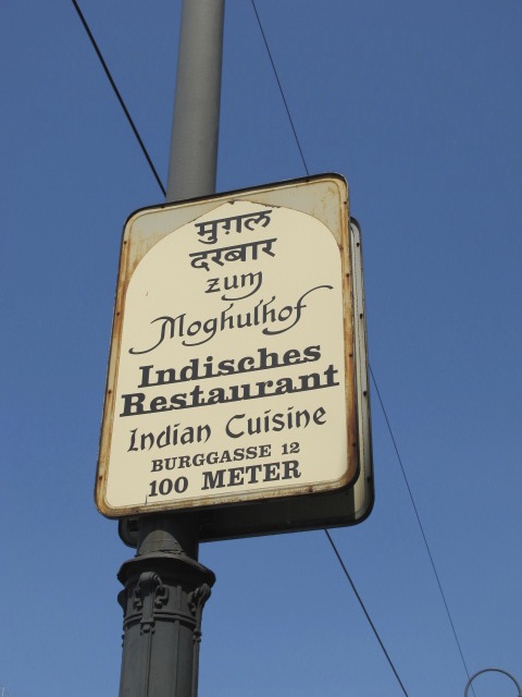
What a fun challenge theme. I love letters. I often photograph signs that I like – for what they say, for the lettering style or even just the look of them when I don’t know what they mean. Here are a few of my favourites from my trip to Austria last year.

 Check out other photo challenge entries here.

Excellent selection of photos, Terr! I never put much thought into font until I began working on my worst seller. There’s so much to consider — size, spacing, normal, bold, italic, just to name a trickle of what needs to be considered. The third sign seemed to be a combination of fonts and some underlining, too. A lot was going on in that one!
LikeLike
Throw in the language mix and we have a winner!
LikeLike
I’m a dork and tried to pronounce all the words in German accent. There’s something very commanding about German.
LikeLike
Is it wrong that they sound funny to someone who doesn’t speak the language?
LikeLike
I think they are amazing.
LikeLike
Thanks!
LikeLike