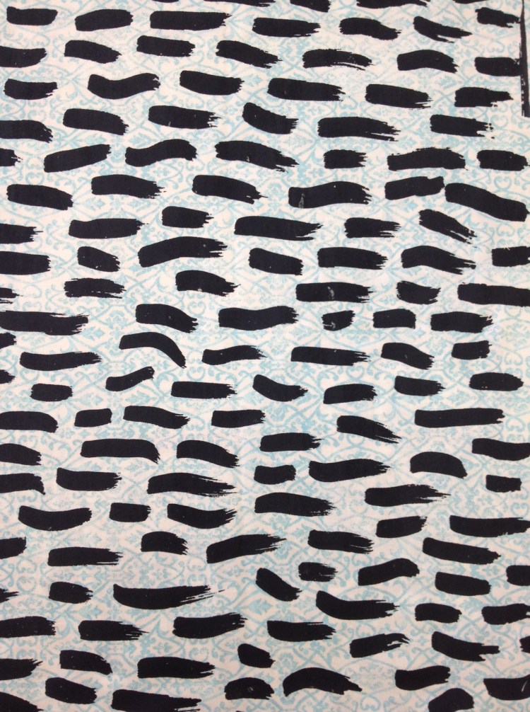
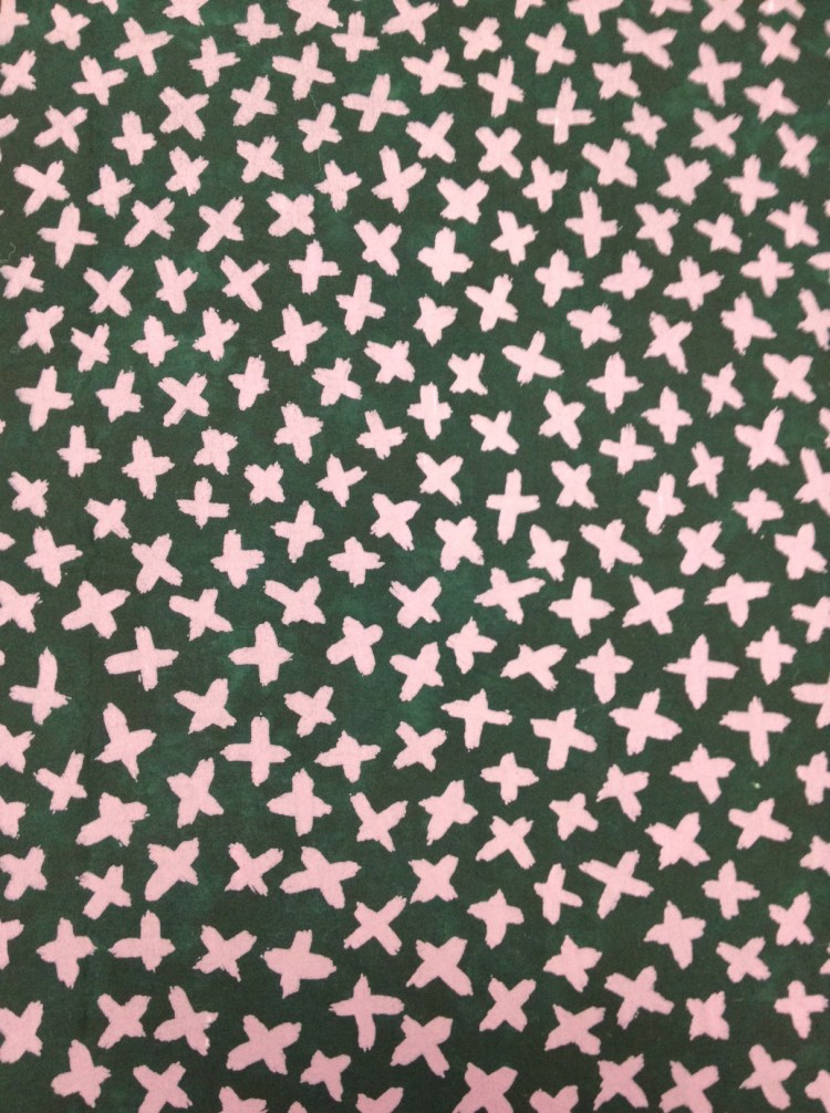
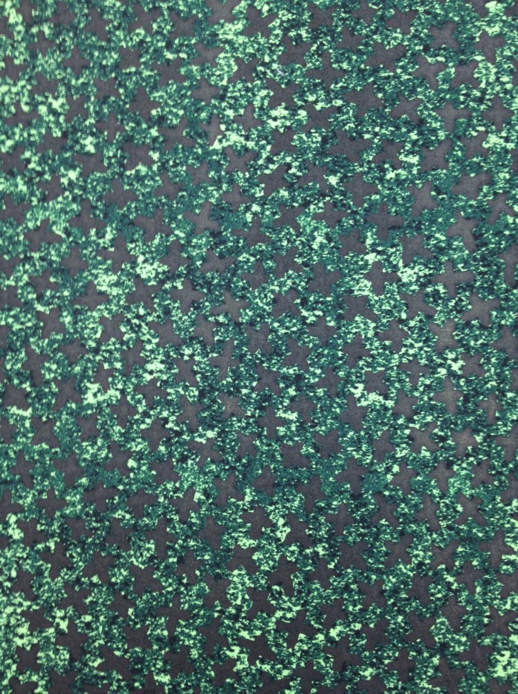
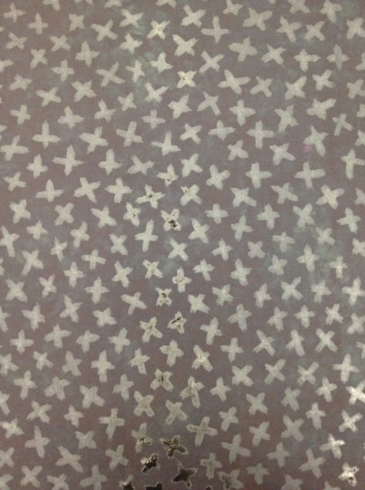
There are so many ways to illustrate contrast that I had a hard time choosing for this week’s photo challenge. Then I realized I should just keep it simple and show a couple of my recent prints. Some of my favourite fabric prints involve high levels of contrast, and others are more subtle. There is a place for both contrasts.

Your prints are gorgeous, simple but enough, you don’t need anything on them to make an statement. Happy Sunday!
LikeLike
Thank you.
LikeLike
All four prints completely nail contrasts, Terri. The third one makes me also think of different texture, but that’s probably more of an optical illusion.
LikeLike
Thanks, V. I think the background print on the third one is tricking your eyes. It is interesting to see how different the same screen looks on different fabrics, and how different one fabric can look with various screens in a variety of colors. It is such fun!
LikeLike
These are great. I’d like to have clothes made from these
LikeLike
Thanks, Rosie. Me too. Now if I could just find someone who has time to see them…
LikeLike
The prints are pretty Terri.
LikeLike